

Visualizations are a great data exploration technique. Our human minds are better able to understand and retain visuals than scripts or text. Visualizations, apart from giving us a good general overview of the data, entail us with an intuitive understanding of the distribution of the dataset and its trends.
Though statistics for datasets give us a good, quick overview of the data and its distribution, in realty, it might not be enough if we are trying to understand the distribution of the dataset.
In data science and its applicability, especially in business and administration, it is very important to understand the distribution of the data. Graphs and visualizations are able to convey the information and the underlying story in a way that numerical statistics cannot.
History does repeat itself, and we want to be able to see it if we want to learn from it.
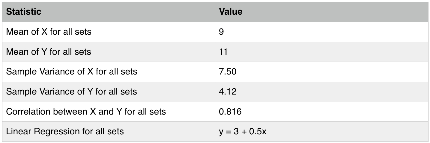
This was proven by F. J. Anscombe in1973 in his paper where he compared four dataset to demonstrate similar summary statistics, but revealed to be largely different when graphed. These four datasets are rightly referred to as the Anscombe’s quartets, which show numerical statistics, even though they may provide a robust parameter, might miss out on explaining certain intrinsic things about the nature of the data.
Because of a plethora of easy to use statistical computing suites, the power and capability of analytics has reached a lot of analysts, scientists, and decision makers. Due to this spread, more and more people are getting comfortable with working with numerical statistics and their underlying implications. However, the importance of visualization, and the power of unearthing a story based off of visualizations, has not spread as much, and sometimes gets overlooked. We want to stress the importance of this unique and empowering feature of analytics. A picture is definitely worth a thousand words.
The Anscombe’s Quartet:
The Anscombe’s Quartet is a group of 4 datasets, with a set of seemingly identical parameters. In the example below, the dataset provided illustrates the scenario.
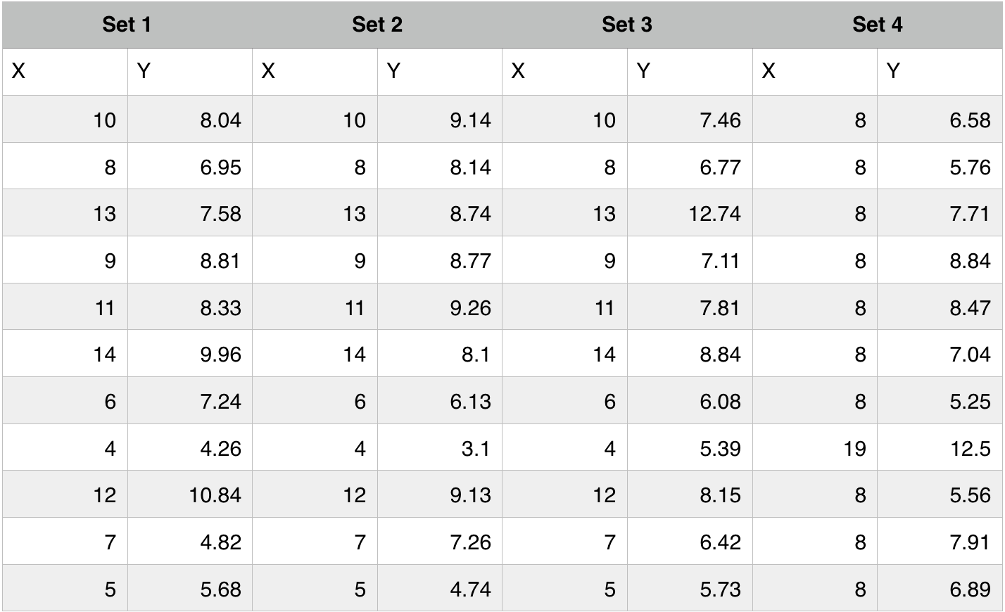
The dataset (Anscombe, 1973):
The Statistical Parameters:
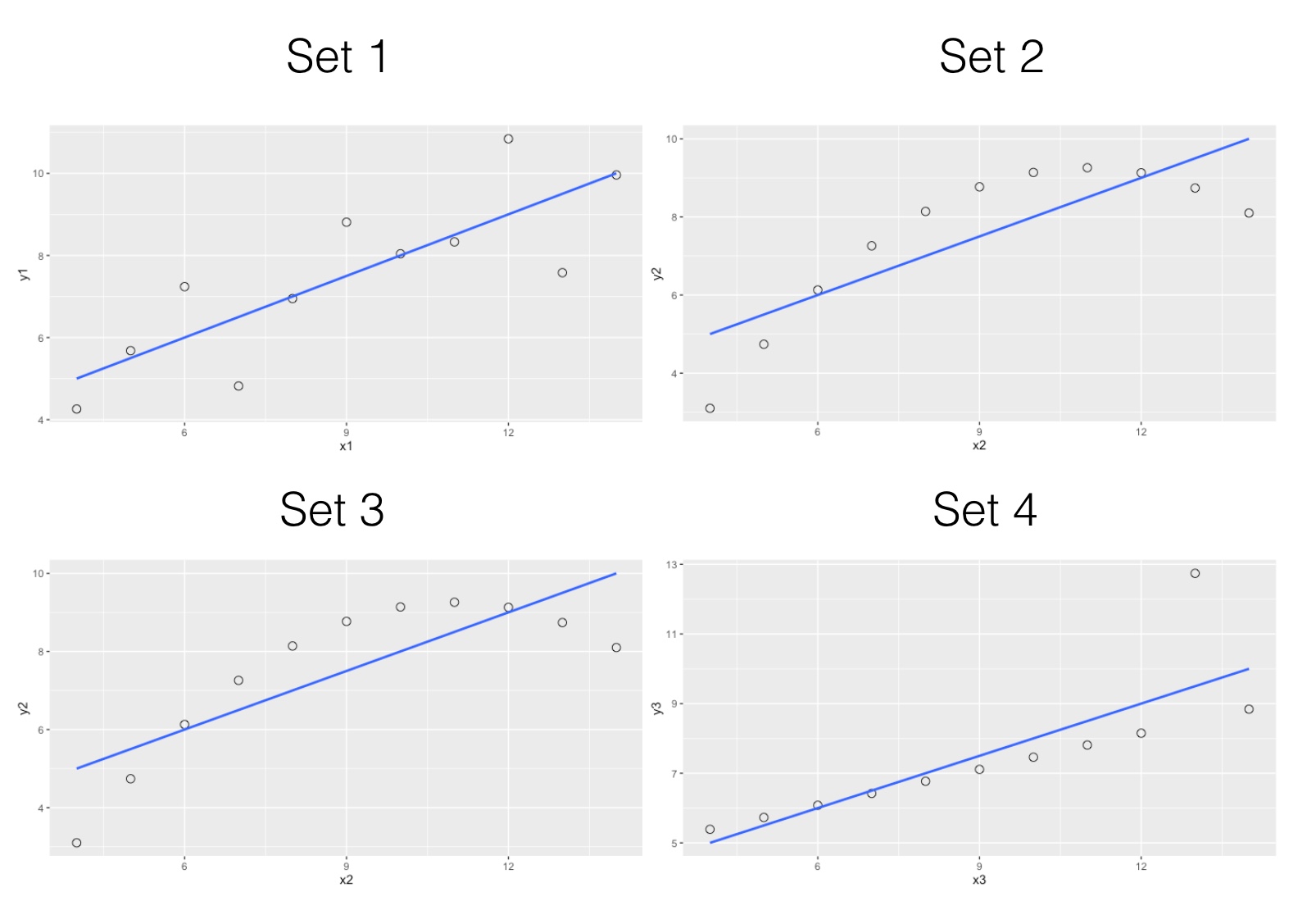
Despite similar summary statistics, we will now see how different these datasets look when graphed.
From a business perspective, visualizations are especially helpful when exploring the data. Understanding the distribution enables the reader to not only understand the dataset and get a better understanding of its underlying factors, it also enables comparisons, especially with historical trends.
Trends and distributions in business have a tend to repeat, or to show familiar trenches and curves. We might not remember summary statistics from a couple of quarters ago, but there is a higher chance we might remember how the distribution of data looked at that point. History does repeat itself, and we want to be able to see it if we want to learn from it.
Let’s look at some examples where visualizations made all the difference
- Outlier Analysis
When trying to fit datasets to a regression line, many-a-times, we may get plagued with rogue data points all around the line of fit. These data points affect the regression model and the line of fit.
Outliers are data points that exhibit characteristics that are quite different from the norm. These points should be studied separately from the rest, hence, they need a different approach from the rest of the data.In some cases, outliers can be removed altogether, if they are considered to be pure exceptions that can’t contribute anything specific to the analysis.
- Detecting Time Series effects
While working with a particular sales data, we came across certain trends that kept repeating themselves. These trends were too regular, to be considered coincidences.
We obtained a dataset ranging a longer time-line, and graphed the behemoth. It turned out that the mysterious recurring trend was a clear autocorrelation effect embedded in the sales data.
Autocorrelation is when the current status of variables is affected by their past status, and this effect is evident and recursive. When we ran the respective tests, sure enough, there was an autocorrelation effect in the dataset.
The nifty graphs allowed us to uncover the trend. We would’ve been running in circles, chasing the tails of one trend after another. Even though such effects can be unearthed using the right tests, visualizations help display such characteristics at once.
- Displaying information across multiple dimensions
Visualizations speak a language that no numbers and words can, and they can say several things at the same time.
Several insights are very intuitive, but are based on meticulous testing and modeling. These tests and models help cross validate findings and formulate predictions. However, when it is time to tell the story, the audience might not be in a position to actually understand all the numbers and their implications.
In that case, visualizations can prove to be a strong base for delivering the findings.
- Data Exploration
Data exploration techniques such as clustering and factor analysis are useful in denoting the relationship of variables amongst themselves. These techniques are powerful methods that enable an analyst formulate a better, high-level understanding of the variables and the dataset in general.
These methods are largely helpful because of their accompanying visual depictions, which explain their components succinctly.
Graphs, such as dendrograms and principle component charts, are helpful in understanding the groups and relations of variables with each other.
References
Anscombe, F. J. (1973). “Graphs in Statistical Analysis”. American Statistician. JSTOR 2682899.